ITF devlog 1 - choosing style
I have been working in Ren'Py (and making games) for two years.
My first game, Guest, was simple when you looked under the hood: a short visual novel where the answers could contribute to a single variable that could trigger a second ending. It took about three or four days to make, and I took a ton of shortcuts. Since then, I've gone back a few times to improve it in small ways.
After that, I made Pet, which I needed to learn a lot more skills to make. And Start Running required a lot of Python knowledge and art skills, to the point where I sometimes am impressed by what I made. A lot of these choices were made based on what I could do: I can't make anime-style backgrounds with my art skill level, and Start Running required point and click background, so I made a house in The Sims 4 and then took copious screenshots and drew over them. Pet needed a vending machine, and I learned some Blender to make/repurpose 3D models to take stunning photos for backgrounds, even though the game is 2d images.
In 2009, I started making Let's Plays. My first couple were in the typical style of the time: live voice-over retro gameplay with lots of improved jokes. I would play the game off-camera for a bit to see how I could do it, and then went back through to record, playing while talking to myself. Quickly though, I started to think about how the game I was playing should inform the type of commentary I did.
I did E.V.O.: Search For Eden and used post-commentary (though I'm sure most people will still believe it was live!). This allowed me to insert animal facts about the creatures that are in the game. This was a huge hit. I played Clock Tower 3, showing off my first playthrough and allowing the game to jump-scare me and freak me out. I also did an LP of Limbo where I only used subtitled commentary; the vibes of the game lent themselves to a nice quiet playthrough that didn't have any voiceover.
My time LPing helped me understand that style sometimes had to dictate my results, that I couldn't just redo what I had done before, and that with growth comes more knowledge of how to do an idea justice.
So, for In The Foundations, I took some time to think before building the bones of the game. Because it was originally a game jam, I first pulled the "template" (aka the exact repo/code) from The Right Phone. I had made The Right Phone in 640x480, as I was trying to give more of an older, low-resolution vibe to it. That game used a watercolor style for the images and the font monogram that I've used in many of my games.
The game jam I was originally planning for, Themed Horror Jam 19, obviously had themes, and the one I chose was about family secrets, tapes, and combination locks. I then found the Monstrous Desires 2024 jam based around visual novels about romance with monsters.
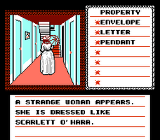
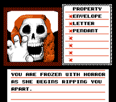
Almost immediately, these two jams together gave me an idea about family trauma and Southern Illinois in November (I spent a few years in my childhood living there, so I knew I could pull from that). For me, this brought to mind retro games, because as someone who is an elder millennial, my childhood was SNES/Genesis era. And then what snapped into my mind was the game Uninvited for the NES.
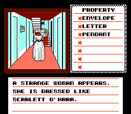
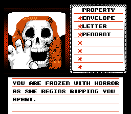
If you've never seen this game before now, it's part of a series that includes Shadowgate and Deja Vu. All of these games share this style, but Uninvited is more of a horror point and click than anything.
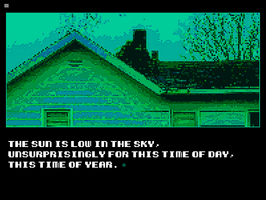
I knew doing a point and click would be too much work during this time, but it didn't mean I couldn't steal the style. I found a free use version of the font that these games used and started to play around with it. It immediately started feeling right.
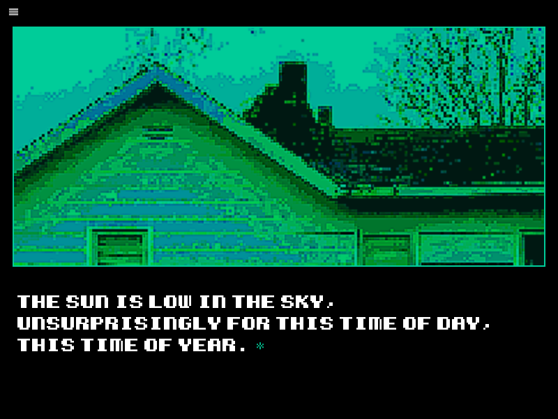
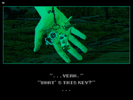
At first, I wanted to make my own pixel art, but that turned out to be much more work than the alternative that I settled on: I either took photos or found CC0 photos that I could heavily crop, edit and compress to fit what I was looking for. I did have to make composites and do additional work as seen in this screenshot here: this is my husband's hand plus a keyring that I put together from images I found online and took.

I chose this specific shade of green-blue (#00cc99) for the game because it evoked that older single color monitor style and also because of some things that would be major game spoilers.
Lastly, I intentionally made music that sounded more like chiptunes or retro music. These songs use more crunchy beats and instruments than my previous games. I used a filter to crush the bit rate of the sounds that I sampled and created.
Overall, for me, it's important to make the game's style thematically fit the content in some way. I could have stuck with the same monogram font and sketchy UI that I've used before, but I think that changing this to align with how the game theming makes me feel will also help the player feel the kind of late-fall-rotting-leaves-sad-nostalgia-for-family-warmth vibes that I am going for.
Most importantly, I didn't try too hard to stick within what would have been possible on a retro system. I still made the game to the specifications of what I wanted it to be and do, because it's more important to evoke the retro feeling than to stick within a "rules" scheme.
And finally, when I realized that because of other obligations I wasn't going to finish this on time for the jams, I decided to continue working on the project. In the past, I haven't had a problem completing a game jam in time, but this idea kept growing and growing, and making the art and music in these styles took more effort than I thought it would be.
It was worth it, and now as I'm releasing this project, I'm happy with the results. Thanks for reading.
Get In The Foundations
In The Foundations
A horror visual novel about coming back to your childhood home.
| Status | Released |
| Author | beepsoft industries |
| Genre | Visual Novel |
| Tags | Atmospheric, Creepy, family, Horror, Meaningful Choices, Multiple Endings, Psychological Horror, Retro, Singleplayer |
More posts
- Steam Release Incoming!Mar 11, 2025
- Patch 1.01Jan 13, 2025
Leave a comment
Log in with itch.io to leave a comment.